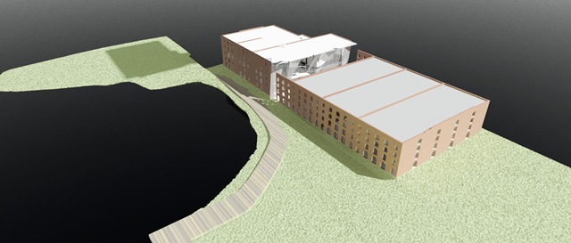
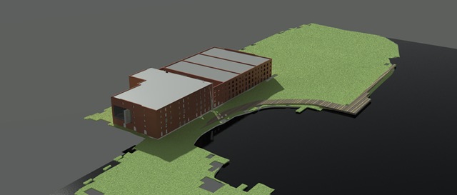
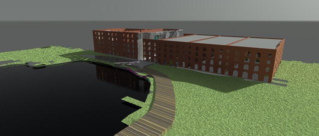
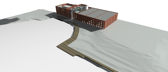
Parts 1 and 3 are not yet published, but this series of images shows the main process of development based on test renderings.
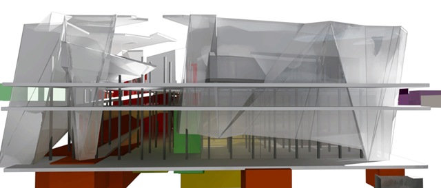
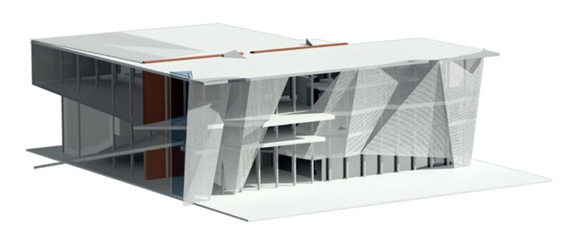
Design began from folding the building in half.
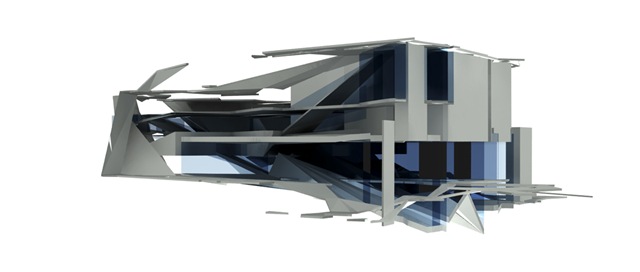
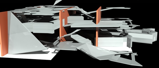
and then attempting to stuff this arrangement of programmed form back into three bays (instead of the 7 bays I was occupying before)
Spaces began to emerge as the existing floors were placed back into the building.
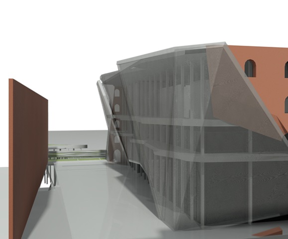
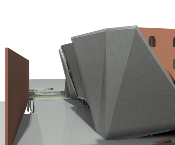
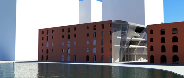
A facade began to emerge even before I worked out the program in the new 3 bay design.
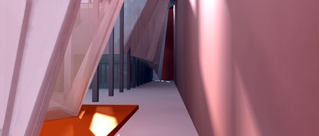
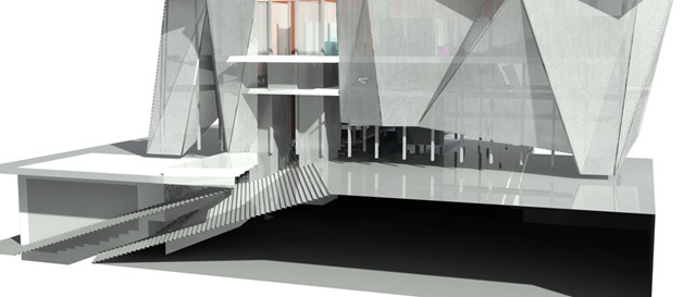
This created a corridor that opened the entrance up vertically and allowed a cavern like quality to be created.
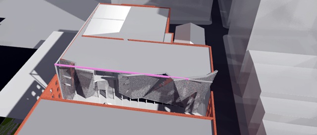
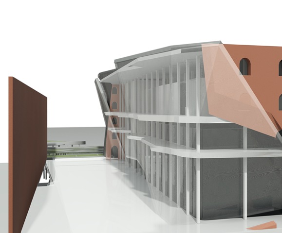
Critics became more interested in the surface of the wall that created the cavern then the space created so it was suggested I take out the adjacent firewall to expose the facade.
I played around with many ideas, including keeping the exterior walls to partially enclose the space,
although in the end the space was completely opened up.
The facade remained unchanged throughout the interior development.
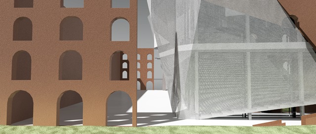
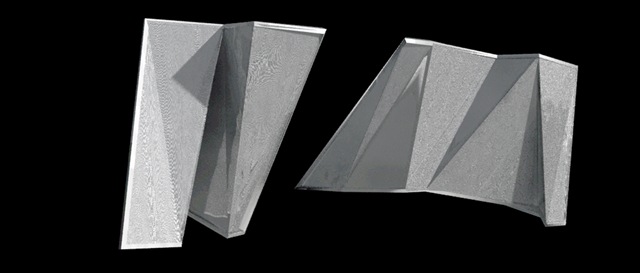
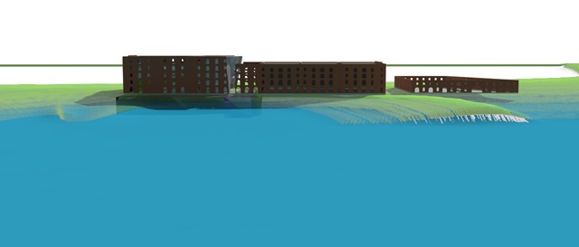
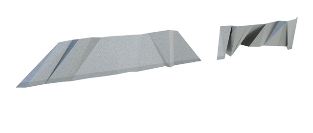
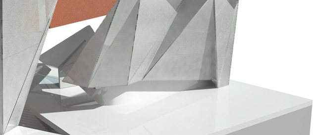
Although when I began site development, I began to incorporate the facade as a way to connect the building to the neighboring park. Unfolded, the facade could make a perfect screen for movies to be shown during summer film nights.
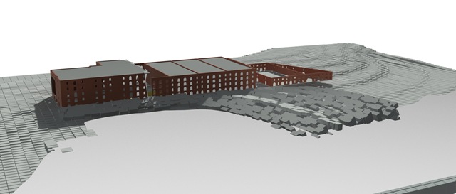
The existing site’s primary attraction was the view of the Manhattan skyline.
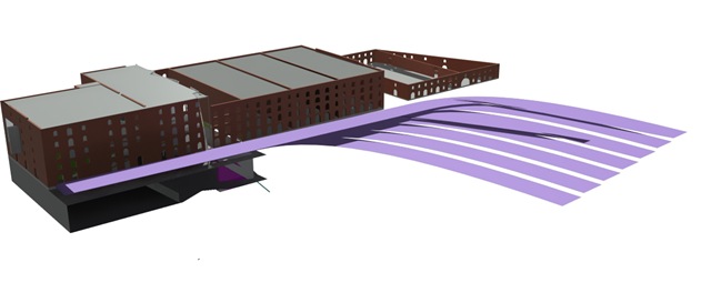
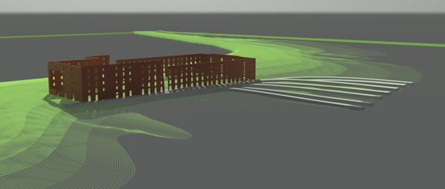
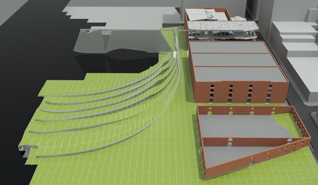
Lines were created using the former rail tracks that were used over 100 years before.
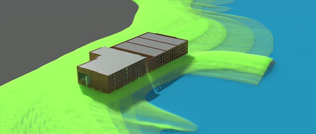
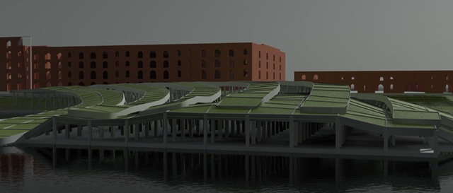
The lines would raise and adjust to the site to become tiered seating in the park that would change the park but would not force all of the other things that take place in a park to conform to the seating created.
The seating converged upon the building to make connections for movement.
The raised seating area provided space to create space for underground parking.
After working through the ik and bones systems in max, i simply unfolded the existing design to create the screen in the park.
Further design development took place in the interior and the project was finished without complete figuring out how the facade could actually be constructed and work. I have several sketches, but do not yet have any drawings or images to show.









i think your formal ideas are off to a good start, but focus on making several good drawings instead of a whole bunch of just ok drawings. boil it down; none of these are smart enough just yet. don't try to get a rendering straight out of the engine- they take some serious layering.
ReplyDeletegood luck.
check this
ReplyDeletehttp://spacesymmetrystructure.wordpress.com/